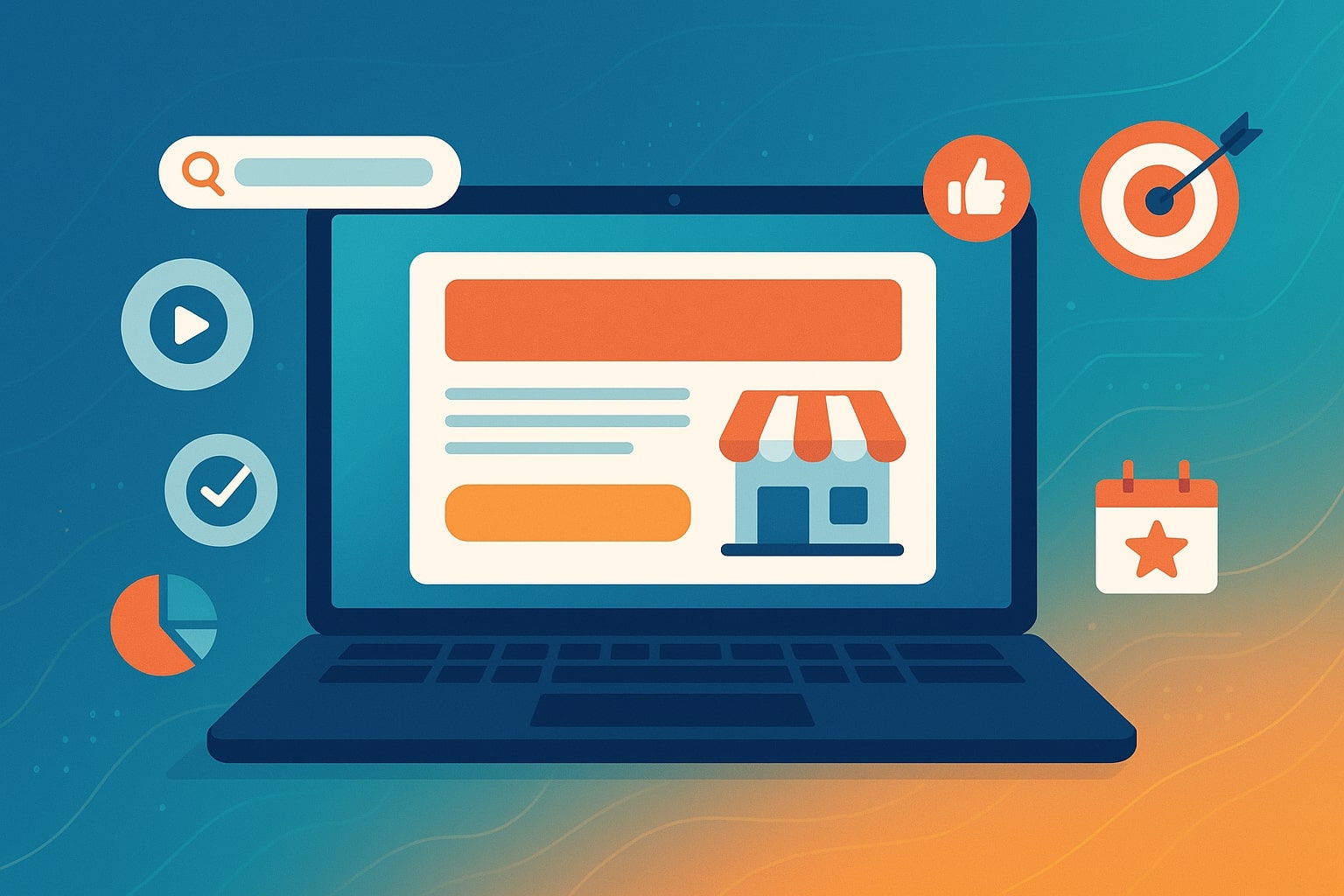
Creating Effective Landing Pages for Local Ads
Creating effective landing pages for local ads is crucial for turning clicks into customers for small businesses. When someone in your area clicks on a local ad (on Google, Facebook, etc.), a well-crafted landing page can immediately address their needs and encourage them to take action.
In fact, almost half of all Google searches have local intent – meaning users are often looking for nearby solutions and are ready to engage. By creating landing pages tailored to local ads, businesses of all types (retailers, service providers, restaurants, etc.) can significantly boost conversion rates and get more value from their ad spend.
This comprehensive guide will explain how to create high-converting landing pages for local ads, covering key page elements, design tips, useful tools (like WordPress, Unbounce, Mailchimp, Google Ads integration), and best practices.
Whether you’re a small business owner, marketer, or web designer, these insights will help you build landing pages that turn local visitors into loyal customers.
Why Local Ads Need High-Converting Landing Pages
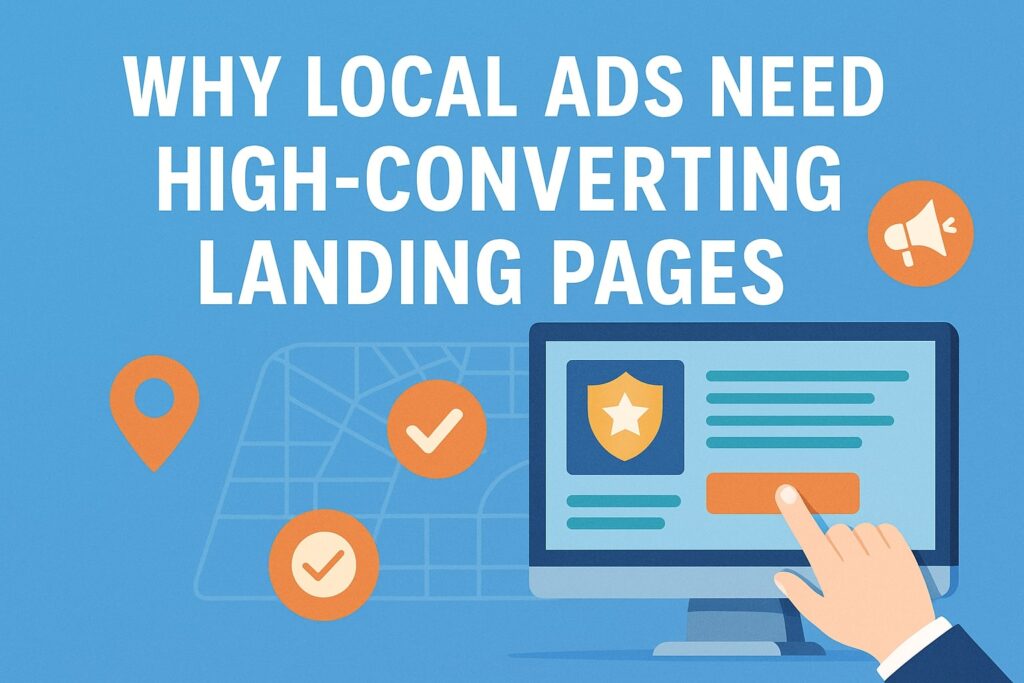
Local advertising campaigns (such as geotargeted Google Ads or social media ads) perform best when paired with dedicated landing pages. Unlike a generic homepage, a landing page for local ads is laser-focused on a specific offer or service and the local audience’s needs. Here’s why investing effort into these landing pages is so important:
- Higher Conversion Intent: People clicking local ads often have strong purchase intent and immediate needs (“I need a plumber now” or “find a cafe near me”).
One survey found 18% of local searches on smartphones led to a sale within one day, compared to just 7% for non-local searches. This “I need it here and now” mindset means a targeted landing page can capture leads or sales quickly if it delivers what the visitor is looking for. - Better Ad Performance and Quality Score: Ad platforms like Google Ads reward relevant, user-friendly landing pages. Google has updated its quality scoring to emphasize landing page experience – if your page is unclear or doesn’t fulfill the ad’s promise, your ad can be penalized with lower ranking and higher costs.
In other words, when your ad highlights a local service or deal, the landing page must deliver that exact info clearly. Consistency between ad copy and landing page content will improve your Quality Score, leading to lower cost-per-click and higher visibility. - Focused Message = More Conversions: A dedicated landing page removes distractions. Unlike a full website, it typically has no global navigation or extraneous information – just a clear message and call-to-action (CTA).
This focus guides local visitors to the one action you want (e.g. call now, book appointment, claim offer). By matching the landing page to the local ad’s message and user intent, you can significantly increase the likelihood that a visitor will convert (contact you, make a purchase, etc.) rather than bounce away. - Personalized Local Content: With landing pages, you can personalize content to the visitor’s location or specific needs.
For example, a local HVAC company might run separate ads for different towns; each ad’s landing page can feature that town’s name, relevant images (like local landmarks or maps), testimonials from nearby customers, and location-specific offers.
This localization builds trust – users immediately see that you serve their area and understand their context. It’s far more compelling than a generic page. (We’ll discuss what local elements to include shortly.) - Higher ROI on Ad Spend: Ultimately, effective landing pages make your advertising dollars work harder. If a campaign is driving clicks but the landing page is weak, you risk wasting money on visitors who leave without action.
A strong landing page will capture a higher percentage of those clicks as leads or customers, improving your conversion rate and lowering your cost per acquisition.
In fact, one analysis found that businesses which expanded from a single generic landing page to 10–15 localized pages saw a 55% jump in conversions, and up to 500% increase with 40+ location-specific pages. This illustrates how tailoring pages to each audience segment or location can dramatically boost results.
In short, local ads + effective landing pages = a winning combination. The ad brings the right people to your door; the landing page’s job is to welcome them and quickly direct them to take the next step. Next, let’s look at what key components make a local ad landing page high-converting.
Key Elements of a High-Converting Landing Page for Local Ads
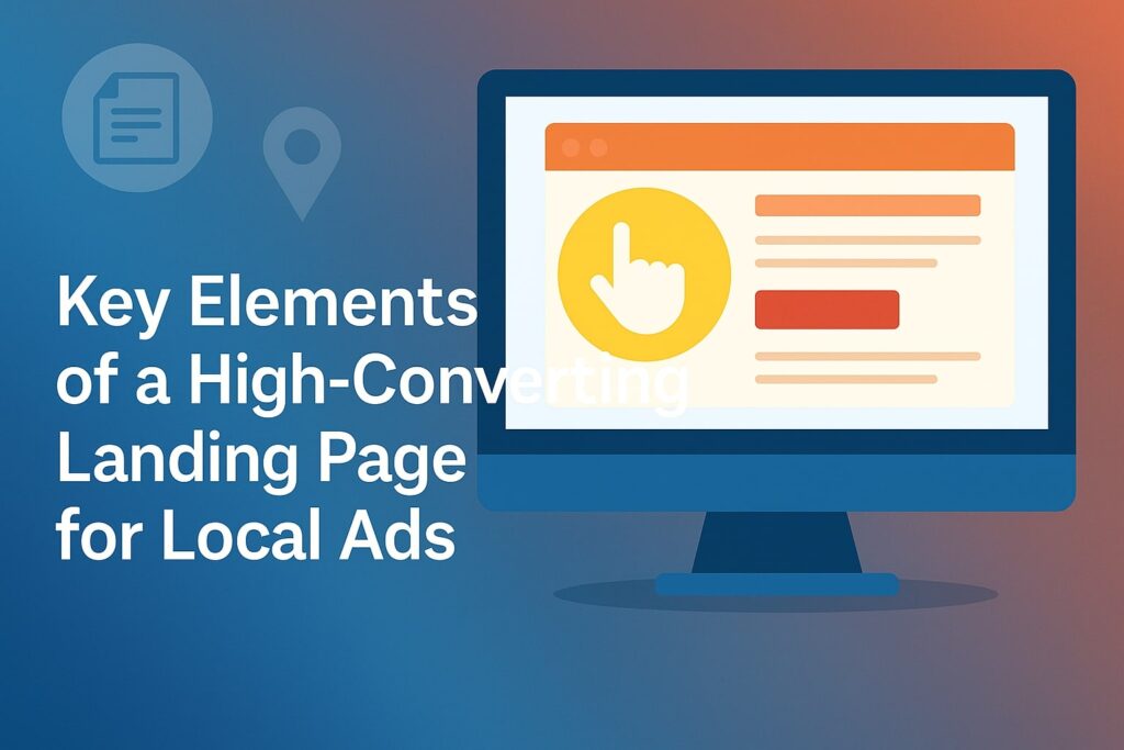
Not all landing pages are created equal. To convert local visitors, your page should include certain critical elements and be structured for clarity and impact. Below are the key components of an effective local ad landing page (applicable to any small business or service):
Structure of a local landing page with essential elements (above the fold content, social proof, local info, etc.) that drive conversions. A well-organized page helps both in SEO rankings and in converting ad clicks into customers.
- Clear Above-the-Fold Section: The “above the fold” area (what’s immediately visible without scrolling) is the most important part of your page. It should instantly communicate what you offer and how to take action.
Include a concise headline (ideally mentioning the service/product and your location or audience), a subheading or brief USP (unique selling proposition), and a prominent Call-To-Action button.
For example, a headline might read “Fast, Reliable Plumbing in [Your City]” with a subtext “24/7 Emergency Service – Serving the [City] area for 20+ years.” Pair this with a CTA like “Call Now for Service” or “Get a Free Quote” at the top.
Make sure the visitor knows they’re in the right place and what to do next, all within a few seconds of arrival. (If your ad promised a specific offer, show it here prominently to meet the user’s expectations.) - Compelling Headline & USP: Your main headline and supporting text should convey a unique selling proposition (USP) – what sets your business apart. This is especially vital in local markets where competitors abound. Why should a customer choose you over the other local options?
Perhaps you offer “Certified Technicians & 1-Hour Response” or “Family-Owned Local Business – 100+ 5★ Reviews.” The USP might be highlighted in a “Why Choose Us” section if not fully in the header. Make sure it’s something that resonates locally (e.g., “Serving [Town] since 1990” or “Voted #1 [Service] in [City]”).
As one expert notes, this section should explain what people get from you that no one else offers – remember you’re competing against other local businesses, not the whole world. Research what others in your area promise, then craft a compelling offer or guarantee that stands out. - Social Proof (Testimonials/Reviews): Nothing converts better than real opinions from other people. Include testimonials or reviews from happy local customers right on the landing page.
This could be a quote or two (“XYZ Roofing fixed our leak in one day – amazing service!” – Jane D., Dallas) or star ratings pulled from Google/Yelp, or even a short video testimonial. Social proof reassures visitors that your business is trustworthy and proven in the community. If applicable, display logos of any local awards or a snippet like “Rated 4.8/5.0 from 200+ customers.”
Seeing that others in their city had a positive experience gives new visitors confidence to contact you. (Make sure to use real and recent testimonials; if they mention the local area or specific outcomes, even better.) - Engaging Visuals (Images/Video): Use high-quality visuals that support your message. Real photos of your business, team, product, or customers can make a strong connection.
For local businesses, showing your actual storefront or team members can humanize your brand (e.g. a photo of the owner or staff smiling, a picture of your service in action at a local site).
Visual cues that reflect the locale are great – for instance, a lawn care company might show a beautiful lawn in a neighborhood typical of your service area. If relevant, a short video can boost engagement (one study found landing pages with video can increase conversions by 86%).
A quick introductory clip or customer testimonial video can work wonders – just ensure it doesn’t autoplay with loud sound (that could annoy mobile users). Also, optimize image/video file sizes so they don’t slow down the page (more on speed later). - Details of Services or Products: Below the initial overview, provide more info about what you offer – but keep it focused on the visitor’s needs. For a service business, you might list your key services with brief descriptions or bullet points (especially if your local ad campaign covers multiple services).
For example: “Our HVAC Services in Phoenix: AC Repair – Furnace Installation – Duct Cleaning – and more.” Make sure this section is still concise and scannable; use subheadings or icons for each service rather than long paragraphs. You can also subtly cross-sell related services/products here.
The idea is to assure the visitor that you can solve their problem and let them quickly find the specific thing they’re looking for if the ad they clicked was more general. If you have a special offer or promotion for local customers, include it in this section (e.g., “$50 off for new [City] clients this month”). - Contact Information (NAP) and Map: Every local landing page should prominently feature your Name, Address, and Phone number (NAP) – preferably near the footer or in a contact strip, as well as in the page body if appropriate.
Local customers often want to quickly call or find directions. Displaying a phone number (with a “Call Now” link on mobile) is key for service businesses – many visitors will tap to call rather than filling a form.
Listing your address helps build trust (you’re a real local presence) and is essential if you expect in-person visits. A small map can be included to show your location or service area; just be careful with embedded Google Maps which can slow down page loading.
You might use a static map image or a link to Google Maps instead, to avoid performance issues.
If you’re a service-area business that doesn’t have a storefront (e.g., a plumber who comes to the customer), you can omit the exact address but mention the service region and perhaps include a coverage area map. - Trust Symbols and Certifications: Include any trust badges, certifications, or awards that apply to your business. These could be logos of professional associations, licenses, insurance, BBB accreditation, or even things like “Google Partner” if you are one.
For some industries, displaying these credentials can be a real conversion driver. For example, a home contractor might show licensing numbers and a “Fully Insured” badge, a medical clinic might show board certifications, a local non-profit might show charity navigator ratings.
Even credit card icons (if it’s an e-commerce local page) or security badges can add a sense of legitimacy. Place these strategically (often near the footer or close to a call-to-action section) so they reassure users at the point of decision. - Localized Content and Flair: To truly connect with local audiences (and to improve local SEO relevance if applicable), sprinkle in some localized content on the page. This might include naming the city/neighborhood in headings and text (naturally, where relevant – avoid awkward stuffing of city names).
You can mention specifics like “serving all of Orange County, including Anaheim, Irvine, and Newport Beach” or reference local landmarks (“located just two blocks from the Springfield Central Library”).
Another great approach is to add helpful local info: for a physical store, mention directions, parking info, or public transit (“Free parking in rear lot; 5-minute walk from Central Station”).
For service businesses, you might mention case studies or projects completed in certain areas (“Successfully remodeled 50+ kitchens in the Greater Dallas area, including Plano and Frisco”).
Not only does this level of detail increase your relevance to the visitor’s area, it also signals that you are truly a local expert. You’re showing you know the community’s specifics, which can build trust and make the visitor feel “at home” on your page. - Frequently Asked Questions (FAQ) Section: A FAQ at the end of the landing page can address common questions or objections that local customers have. This is a smart way to provide extra info without cluttering the main page or overwhelming the reader.
Think about questions your business often receives, especially those relevant to local services: “How fast can you get here in an emergency?”, “Do you service [nearby town]?”, “What are your COVID-19 safety measures?”, “Is there a fee for estimates?”, etc.
Present a few of these with concise answers. This not only helps the user by clearing up doubts (which might otherwise prevent them from converting), but FAQs can also improve your search visibility by capturing “People also ask” queries.
Keep answers brief and to the point – you can always invite them to call for more detailed inquiries. The presence of an FAQ also reinforces that you are experienced (you know what people want to know) and transparent with information.
Finally, ensure your call-to-action (CTA) is repeated or always accessible as the visitor scrolls. For example, if you have a “Contact Us” button that jumps to a form or a phone number, consider a sticky header or a bottom banner on mobile saying “Call 555-1234 for a Free Quote” so that the invitation to convert is constant.
Don’t overdo it, but make sure after consuming all this great info, the user has an easy way to take the next step.
By including these elements, you cover both conversion optimizers (clear CTA, social proof, trust signals) and local relevance boosters (localized keywords, directions, local testimonials). It’s this combination that makes a landing page effective for local ads, turning a curious click into a satisfied customer.
Design and UX Best Practices for Local Landing Pages
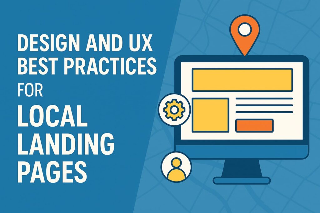
Having the right content is crucial, but how you design and present that content will make a big difference in performance. Good landing page design ensures that visitors don’t get confused or frustrated – instead, they smoothly find what they need and convert.
Here are some key design and user-experience (UX) tips when creating landing pages for local ads:
- Mobile-First Design: Local searches are overwhelmingly done on mobile devices. Over 57% of local searches are on mobile phones, so your landing page must look and work great on small screens. Use a responsive design that adapts to different screen sizes.
Important elements (headline, CTA buttons, phone number) should be prominent and not require zooming. Large tap-friendly buttons (e.g. a “Call Now” button) are essential – remember mobile users can directly click to call.
Also, consider using a fixed call bar or contact button at the bottom of mobile screens for easy access. Test your page on various devices to ensure everything (text, images, forms) is readable and not cut off. Mobile users are often on-the-go, so the page should get to the point quickly and allow action with minimal typing. - Fast Loading Speed: Speed can make or break your conversion rate. Local visitors won’t wait long – if a page loads slowly, they might hit “back” and try a competitor. Moreover, Google’s ad platform also considers page speed as part of the user experience (affecting quality score).
Optimize your landing page for performance: compress images, minify code, and use fast hosting. Aim for your page to load in a few seconds (under 3 seconds is a good goal). One tip is to be cautious with heavy elements like large background videos or Google Maps embeds – these can slow down load times.
If you include them, use lazy-loading or static alternatives. A faster page keeps users engaged and also signals to Google that you’re providing a good experience. - Simplicity and Clarity: Adhere to the principle of “don’t make me think.” Your landing page should have a clean, uncluttered layout that guides the eye to the most important parts (headline, offer details, CTA).
Avoid long walls of text – break content into digestible sections with headings, bullet points, or icons. Large blocks of text can overwhelm and turn off visitors (and indeed, “walls of text” are conversion killers).
Use an easy-to-read font and adequate font size (especially on mobile) so users aren’t squinting. Keep the color scheme consistent with your branding, but also use high contrast for calls-to-action (e.g., a bright button color that stands out from the background).
Whitespace (empty space) is your friend; it helps important elements stand out and makes the page feel professional. Also, maintain a logical flow – for instance, important info and CTA at top, details and supporting info in the middle, and backup info (FAQ, fine print, secondary links) at bottom. - Minimize Distractions: Remember, a landing page is meant to focus on one main conversion goal. It’s usually best to remove navigation menus or extraneous links that could lead the visitor elsewhere.
You generally don’t want them clicking off to read your blog or check other products – that can wait until after they convert. Many high-converting landing pages use a very stripped-down header (or none at all besides maybe your logo) to keep attention on the offer.
Any additional content you include should support the conversion goal. For example, avoid clutter like unrelated sidebar content, multiple different CTAs (don’t ask the user to both call and also subscribe to a newsletter and also follow your Facebook – choose the primary action you want).
Keeping the page focused and easy to navigate (with perhaps anchor links for longer pages) will result in better user satisfaction. Google itself advises making landing page navigation simple and not burying important info behind multiple clicks. - Strong Visual Hierarchy: Design the page such that the most important elements catch the eye first. Typically, that means a bold, benefit-driven headline, a contrasting CTA button, and perhaps an eye-catching relevant image in the hero section.
Use size, color, and placement strategically. For instance, make sure your “Contact Us” or “Get Quote” button is large and in a color that pops. Headlines should be larger font than body text.
If you have key points or benefits, consider using icons or checkmarks and highlight the text so that scanning visitors can pick them up quickly. A visitor should be able to glance at the page and identify the main offer and next step without having to read every word. - Use of Media and Interactive Elements: Adding media like images, videos, or even small interactive tools can increase engagement – but use them thoughtfully. We’ve discussed images and their importance for local feel.
If using a background video or animation, ensure it doesn’t distract from the CTA or make the text hard to read (for example, don’t put a moving video behind your main text without a clear overlay). For videos, a good practice is to include a play button rather than auto-playing.
Also consider interactive elements that might help local users: for example, a “find on map” widget, a date-picker if booking appointments, or a live chat option if you can support it (live chat can be great for answering quick questions, though for small businesses it might not be feasible 24/7 – you could use a chatbot or simply provide a prominent phone number instead).
Always test these features – any element that might not load or work on some devices should have a fallback. Simplicity and reliability trump fancy features in most cases. - Accessibility and Professionalism: Good design also means making your page accessible to all users. Use good color contrast for text (important for visibility in sunlight on mobile and for color-blind users). Add alt text for images (not just for accessibility but also for SEO benefits).
Ensure the page can be navigated by keyboard (for those who might not use a mouse or have disabilities). These considerations not only widen your potential customer base but also generally improve the clarity of your page’s design.
Additionally, double-check for any spelling errors, broken links, or misaligned elements – those can hurt your credibility. A polished landing page suggests a professional, trustworthy business. - No Annoying Pop-ups (Especially on Mobile): This is worth noting: avoid aggressive pop-ups or interstitials that cover the content, especially when someone just landed from an ad.
For example, don’t immediately show a newsletter signup pop-up or an unrelated offer; that creates friction and frustration. Google has explicitly called out that pop-ups blocking the page can harm the user experience and your ad performance.
If you must use a pop-up (say, to offer a coupon), consider timing it or using an exit-intent trigger so it’s not the first thing a user sees. In most cases, it’s safer to integrate any offer into the page itself rather than a pop-up. Keep the user’s path to conversion as smooth as possible.
In summary, make your landing page easy to use, fast, and focused. A local customer should land on it and immediately feel “this business understands what I need, and I can see how to get it.”
Good design builds trust: a modern, well-organized page gives a great first impression of your business (often the landing page is the prospect’s first interaction with you). By following these UX best practices, you reduce barriers to conversion and let your compelling content do its job.
Tools and Platforms for Creating Landing Pages (WordPress, Unbounce, Mailchimp, etc.)
You don’t need to be a web developer to create an excellent landing page. Today there are many tools and platforms that make it easy to build landing pages for local ads. Below, we’ll cover a few popular options and their pros/cons, including examples like WordPress, Unbounce, and Mailchimp.
We’ll also touch on how Google Ads ties into your landing page strategy. Use these tools to simplify the page creation process and optimize for conversions:
- Website Builders / CMS (e.g. WordPress, Wix): If your business website is built on a content management system like WordPress, you can create landing pages directly on your site.
WordPress is a flexible platform, and with plugins or themes you can design custom pages relatively easily. For instance, many small businesses use WordPress with drag-and-drop page builder plugins (such as Elementor, Divi, or Beaver Builder) to craft landing pages without coding.
The advantage here is that your landing page lives on your domain (e.g., yourwebsite.com/special-offer) and can seamlessly integrate with your site’s analytics and lead capture forms. It’s also cost-effective – WordPress itself is free, and many plugins have free versions.
However, it may require a bit more effort to get the design just right, especially if you’re not using a pre-made template. You’ll also need to ensure your site is fast and can handle the traffic from ads. WordPress is ideal if you want full control and already have a site – you’re essentially expanding it with dedicated landing pages. - Dedicated Landing Page Builders (e.g. Unbounce, Instapage, Leadpages): These are online services specifically made for creating high-converting landing pages quickly. Take Unbounce as an example – it provides a drag-and-drop page editor, a large library of templates, and built-in tools for A/B testing and conversion analytics.
Marketers love such platforms because you can deploy a new page in hours, not weeks, and you don’t need IT for changes. Unbounce even allows multiple variants and smart traffic routing to optimize conversion. In one platform you get page building, publishing (usually on a subdomain or your domain via integration), and optimization tools.
The downside is cost – these services typically charge a monthly fee (Unbounce, for instance, has subscription plans). They are worth it if you’re running serious ad campaigns and need to maximize conversions.
Another consideration: your pages might be hosted on the platform’s servers (though often you can use a custom domain so visitors won’t know).
Overall, if budget permits, dedicated landing page tools are a great choice for small businesses and marketers who want ease of use and conversion-focused features out-of-the-box. - Email Marketing Platforms with Landing Pages (e.g. Mailchimp, HubSpot): Some email marketing or CRM platforms offer landing page builders as part of their toolkit. Mailchimp, known for email newsletters, has a simple landing page creator included – even on the free plan, Mailchimp allows unlimited landing pages.
This is a convenient option if your primary goal is to capture leads (emails) or promote something to your mailing list. You can design basic pages using Mailchimp’s templates and any sign-ups go straight into your Mailchimp audience list.
It’s fairly beginner-friendly. However, these integrated builders are usually more limited in design flexibility and features. For example, Mailchimp’s landing page template selection is small and lacks advanced elements (no built-in A/B testing in Mailchimp’s case).
Still, for many small businesses, the combination of free landing pages, email capture forms, and auto-follow-up emails in one platform is appealing. Similarly, HubSpot’s free tier offers landing pages with CRM integration.
If you’re already using an email marketing service, check if it has a landing page module – it could be a quick win for building a page without extra cost or tools. - Google Ads and Landing Page Integration: While Google Ads itself is not a page-building tool, it’s important to mention how it interacts with your landing page.
First, Google Ads provides a Landing Page Experience assessment (as part of Quality Score) – ensuring your page is relevant, loads fast, and is mobile-friendly will improve this score.
Google Ads also offers tools for tracking conversions on your landing page. For example, you can use Google Analytics (GA4) or set up a Google Ads conversion tracking code on your page to record when users take the desired action (like submitting a form or clicking “call”). It’s crucial to configure this so you know how your page is performing.
Moreover, Google Ads has features like Dynamic Text Replacement offered by some page builders (Unbounce has this) which can insert the search keyword or location dynamically on your landing page to better match the ad – something to explore if you serve multiple local areas with one template.
If you use Google Analytics, monitor metrics like bounce rate or time-on-page for your ads’ visitors – high bounce rates might indicate the page isn’t meeting expectations.
In summary, treat Google Ads and your landing page as a tandem: use Google’s feedback to refine your page (for instance, improve clarity if your Quality Score is low due to relevancy issues), and track user behavior to optimize further.
To compare these platform options at a glance, here’s a quick overview:
| Platform/Tool | Best For | Key Features & Notes |
|---|---|---|
| WordPress (or other CMS) | Businesses who want to build landing pages on their own website, with full control. Developers or DIY users comfortable with plugins. | Highly flexible and customizable. Can use page builder plugins or themes to design pages. No additional monthly cost if you already host a site. Pros: Full ownership of pages on your domain; endless plugin options (forms, SEO, etc.). Cons: Requires setup and maintenance; quality depends on your design skills or templates; must ensure good page speed and mobile design yourself. |
| Unbounce (or Instapage/Leadpages) | Marketers and small businesses focused on conversion optimization, who need to create and test pages quickly without coding. | Dedicated landing page SaaS with drag-and-drop editor and conversion tools. Comes with built-in A/B testing and analytics, and many high-converting templates to start from. Pros: Very fast to build pages; features like dynamic text insertion, sticky bars, pop-ups, etc.; can publish to your domain and integrates with marketing tools. Cons: Subscription cost; you’re dependent on the platform; design flexibility is good but very complex designs may require custom code. |
| Mailchimp (Landing Pages feature) | Small businesses or beginners who primarily want to capture leads (emails) or promote simple offers, and are already using Mailchimp or want a free option. | Part of an email marketing platform – create basic landing pages and connect to email campaigns. All Mailchimp plans (even free) include unlimited landing pages. Easy, template-driven builder – no coding. Pros: Free to use; integrates with email/CRM (form submissions go to your Mailchimp list); quick to set up for basic needs. Cons: Limited design options (only ~10 templates, fewer content blocks); lacks advanced features like A/B testing; URL is on Mailchimp domain unless you use a custom domain (paid feature). |
| Google Ads (integration, not a builder) | Marketers running PPC campaigns – ensuring the landing page works in harmony with the ad platform for maximum performance. | While you can’t build pages in Google Ads, use it to monitor and improve page effectiveness: – Quality Score metrics for landing page relevance and experience (make sure your page is clear and matches ad keywords). – Conversion Tracking: add Google Ads or Analytics tags to measure leads/sales from the page. – Google PageSpeed Insights: test your landing page URL to get suggestions to improve speed (fast pages may improve ad rank). Pros: When optimized, a great landing page can improve ad rankings and lower costs. Google Ads also now flags issues like mobile usability or intrusive pop-ups that you should fix. Cons: N/A – but note that without a good page, your ad money can be wasted. So always consider the landing page as critical to your Google Ads success. |
Table: Comparison of different platforms for creating landing pages. Each business should choose based on their budget, technical comfort, and needs – some might use a mix (e.g., WordPress site but also an Unbounce page for a special campaign). Regardless of platform, remember to follow the best practices (content and design) we’ve discussed.
Testing and Optimizing Your Landing Page
Creating your landing page is not a one-and-done task. The best marketers continuously test, measure, and improve their landing pages to get even higher conversion rates over time. Even small tweaks – like changing a headline or the color of a CTA button – can impact results. Here’s how to approach optimization for your local ad landing pages:
- A/B Testing (Split Testing): This is one of the most powerful techniques for optimization. A/B testing means creating two (or more) variants of your landing page with one element changed, and splitting traffic between them to see which performs better.
For example, you could test Headline A vs. Headline B, or a green “Sign Up” button vs. a red “Sign Up” button, or with vs. without a testimonial slider. Over a sufficient number of visitors, you’ll see which version converts more.
Tools like Unbounce have A/B testing built-in, and Google Optimize (now deprecated but other alternatives exist) or Google Analytics Experiments can also do this for pages on your own site.
Start by testing big impactful elements: headline text, primary call-to-action wording, or perhaps an image. Once you identify a winner, iterate with another test. As Google’s guidance emphasizes, “Test & Improve – A/B testing helps you find weak spots and fine-tune the experience for better results.”
Do be sure to run tests long enough to get statistically significant results (and account for different times of day or days of week behavior). Over time, these incremental gains add up to a significantly higher converting page. - Analyze User Behavior: Use analytics tools to understand how visitors interact with your page. Google Analytics can show you the bounce rate (what percentage leave without clicking anything), time spent on page, and possibly the drop-off points if you have a multi-step process.
A high bounce rate might indicate the page isn’t relevant enough or is confusing – you may need to refine your headline or ensure the ad targeting matches the page content. Besides GA, consider tools like heatmaps or session recordings (e.g., Hotjar, Crazy Egg).
Heatmaps can visually show where users click and how far they scroll. If you find, for example, that hardly anyone scrolls below the fold, it means your top section must do all the heavy lifting (or that an important detail might be too low on the page).
Or if many users click on an element that isn’t actually a button (perhaps an icon or image), you might consider making it clickable or clarifying it. These insights take some guesswork out of optimization – you can base changes on real user data. - Conversion Tracking and Metrics: Make sure you have a clear definition of what a “conversion” is for your page and track it. For local landing pages, a conversion could be a form submission, a phone call, a purchase, or a click on a specific link (like an email link or “Directions” button).
Use conversion tracking through Google Ads and/or Analytics so you can measure your success. For phone calls, you can use call tracking numbers or Google’s call forwarding (for Ads) to count how many calls originated from the page.
By looking at metrics like conversion rate (conversions divided by page visitors * 100%), you can quantify improvements. For example, if your page initially converts 5% of visitors, and after some changes it’s 10%, that’s a huge doubling of leads – but you only know that if you measure it.
Also, track cost per conversion if tied to ad spend, to see how landing page changes affect your ROI. - Gather Feedback: Sometimes, especially for small local businesses, it’s valuable to get qualitative feedback. You could ask a few trusted customers or friends to navigate the page and give their impressions – is anything confusing? What convinced them or didn’t?
Alternatively, if you have an email list, you could run a quick survey asking what information people needed before they decided to contact a business like yours, then see if your page addresses those.
On-site, using an exit-intent pop-up asking “What stopped you from signing up today?” might gather some responses (use sparingly). While not everyone will answer, even a few insights can highlight areas to improve (e.g., maybe people wanted to see pricing on the page but you hid it – and that deterred them). - Optimize for Local SEO (if relevant): While the primary purpose of a landing page for local ads is to convert paid traffic, having a well-optimized page can also benefit your organic search presence. Over time, your local landing page might start ranking for certain location+service keywords, bringing in free traffic.
So it doesn’t hurt to follow basic local SEO practices: include your city or region in the title tag and headings (naturally), ensure your business Name, Address, Phone on the page matches exactly what’s on your Google Business Profile (for NAP consistency), maybe embed a Google Map or a link to your Google Maps listing, and use schema markup (LocalBusiness schema) if you can for your address and phone.
These steps can improve your local relevance. That said, don’t sacrifice conversion copywriting just to stuff in more keywords – balance is key. A well-rounded page can serve both paid and organic campaigns. - Keep It Updated: Periodically review your landing page and update any information that’s outdated. For instance, if you changed your business hours, address, or phone number, immediately reflect that on the page (inconsistent info can confuse customers and hurt trust).
If you mention a promotional offer (“Spring 2025 Sale!”), update or remove it after it expires. An outdated page can also rank lower on Google, whereas a freshly updated page might get a slight boost.
Especially for multi-location businesses, commit to updating each location’s page with any new award, new testimonial, or community involvement (e.g., “We’re proud to sponsor the 2025 City Marathon – come see us there!”). Such tweaks keep the content fresh and locally engaging. - Apply Learnings to New Pages: As you optimize one landing page, take note of what works and apply it to future pages or other locations. You might discover, for example, that having a video testimonial increased conversions on your plumbing service page – maybe do the same for your electrical service page.
Or you found that a particular phrasing of the CTA (“Get a Free Quote”) outperformed another (“Contact Us”) – now you can use the winner on all your pages. This way, testing one page yields insights that uplift your entire marketing effort.
Just remember that different audiences can behave differently (what works for a page targeting downtown city clients might not work the same for a suburban audience), so when in doubt, test variations in each context.
By following these optimization practices, you create a cycle of continuous improvement. The result is a high-converting landing page for local ads that just keeps getting better. Even a modest increase in conversion rate can mean a lot more revenue or leads from the same ad spend, which is huge for a small business.
Lastly, celebrate the wins – if you’ve turned more clicks into customers thanks to your landing page tweaks, that’s real growth for your business. Keep user experience at the center of your decisions, and your landing pages will continue to drive success for your local marketing campaigns.
FAQs
Q: What exactly is a “landing page” for local ads, and how is it different from my homepage?
A: A landing page is a dedicated, standalone web page created for a specific marketing campaign or purpose. For local ads, it’s the page where people “land” after clicking your ad. Unlike your general homepage (which covers all aspects of your business), a landing page is narrowly focused on the offer or service featured in the ad and tailored to the needs of local customers.
For example, if you run an ad for “24/7 Emergency Electrician in Springfield,” the landing page would talk specifically about your Springfield emergency electrician services, show a contact number for immediate help, local testimonials, etc., without linking out to unrelated pages.
This singular focus helps increase conversion rates – one study noted that businesses using many targeted landing pages saw significantly higher conversions than those sending all traffic to a generic page.
In short, your homepage is like a broad introduction, while a landing page for an ad is a customized sales pitch for one topic, making it much more effective at converting ad clicks into leads or customers.
Q: What key elements should I include on a high-converting local landing page?
A: You should include all the essential components that address both conversion best practices and local relevance.
At minimum, make sure to have: a clear headline (mentioning the service/product and location if possible), a compelling subheadline or USP (why choose you), a prominent call-to-action (e.g. “Call Now,” “Get a Free Quote,” “Schedule Appointment” – whatever your primary goal is), and your contact info (phone number, address, etc.) readily visible.
Add social proof like customer testimonials or ratings to build trust. Use at least one relevant image (e.g. of your business, team, or work) – visuals help engagement. If applicable, include a short description of your services or offer details, focusing on local availability (what areas you serve, any local specializations).
It’s also highly recommended to put an FAQ section at the bottom addressing common questions or concerns. And if you have any credentials or local awards, display those logos for credibility.
Essentially, the page should immediately tell the visitor they’re in the right place for a [your service] in [their locality], give them reasons to trust you (reviews, credentials), and guide them to take action via a clear next step. Our guide above details nine key sections – from above-the-fold content to maps and FAQs – that have proven effective for local landing pages.
Q: How can I create a landing page easily if I’m not a web designer or developer?
A: You have several user-friendly options to create landing pages without coding. If your website is on WordPress, you can use drag-and-drop page builder plugins (like Elementor or SeedProd) that let you choose a template and customize text, colors, and images through a visual editor.
There are also specialized landing page builder services like Unbounce, Leadpages, or Instapage which are made for non-designers – you pick a template, edit content, and publish, all through a simple interface. These services handle the technical parts (hosting the page, ensuring mobile responsiveness, etc.) for you.
Another easy route is using your email marketing platform if it offers landing pages – for example, Mailchimp’s landing page builder is quite straightforward and available even on the free plan. It provides basic templates you can fill in with your text and images.
Many of these tools have what-you-see-is-what-you-get editors, so if you can make a PowerPoint slide, you can likely make a landing page. They also offer support and tutorials to guide beginners.
Start with a template that closely matches the layout you want, then swap in your content. For small businesses, these no-code solutions are usually sufficient to produce a professional-looking landing page for local campaigns.
Q: What are some ways to optimize my local landing page’s performance after it’s live?
A: Once your page is live, optimization is an ongoing process. Here are a few high-impact ways:
(1) A/B test different elements of the page – for instance, create a second version with a different headline or a different call-to-action button color, and split the traffic to see which gets a better conversion rate. Over time, testing helps you refine the page. (
2) Check your analytics – look at metrics like bounce rate (are people leaving immediately?) and conversion rate (percentage of visitors who take the desired action). If bounce rate is high, you may need to make the top of the page more relevant or faster-loading.
(3) Use tools like heatmaps or session recordings to see how users interact. For example, if a heatmap shows almost no one scrolling down, it might mean the most important info or CTA needs to be higher on the page.
(4) Solicit feedback – you can add a small survey (“Was this page helpful? Any suggestions?”) or ask a few customers directly. They might tell you, for example, that they didn’t see pricing info or couldn’t find the address – which you can then fix.
(5) Ensure the page stays up-to-date – update any seasonal content, offers, business hours, etc. Outdated info can confuse or deter customers.
By measuring and tweaking, you can often turn a decent landing page into a great one that maybe doubles your conversions.
Q: How do landing pages affect my Google Ads (or other ad platforms) and their “Quality Score”?
A: Landing pages have a direct impact on Google Ads Quality Score, which in turn affects your ad ranking and cost per click. Quality Score is Google’s way of rating the relevance and experience of your ads and landing pages for the people who see them.
If your landing page is closely relevant to your ad and keyword, loads quickly, and provides a good user experience, Google rewards you with a higher Quality Score. This can mean your ads rank higher and you pay less for each click (because Google favors ads that users have a good experience with).
On the other hand, if your landing page is low-quality – for example, not clearly related to the ad, full of pop-ups or misleading info, slow to load, or not mobile-friendly – Google may give you a poor Quality Score.
Consequences include your ads showing less frequently, possibly being pushed below competitors, or you having to bid more to get the same visibility. In 2025, Google even updated its system to penalize things like unclear CTAs or “bait-and-switch” promises on landing pages.
The takeaway: make sure your landing page aligns with your ad copy and keywords, is transparent about any offers (no hidden fees or surprise requirements), and provides a fast, easy navigation for users.
By doing so, you not only convert visitors better, but you also keep Google (or Facebook, which has similar relevance scores) happy – which improves your overall campaign efficiency.
Q: Should I create separate landing pages for each local area or service, or use one page for everything?
A: Wherever possible, it’s best to create separate, focused landing pages for distinct local areas or distinct offerings. The principle is that the more tailored a page is to the visitor’s specific context, the higher the chance of conversion.
If your business serves multiple cities or has multiple locations, you’ll want a page for each (each with localized content like the city name, address, map, and area-specific info).
For example, a dentist with offices in Austin and Houston should have one page for Austin patients and another for Houston patients, rather than a one-size-fits-all page – that way each page can speak about the specific office, local testimonials, parking info, etc.
Similarly, if you offer different services that attract different types of searches or ad campaigns, separate pages can work better. Say you’re a home services company: a landing page for “AC Repair” and another for “Heating Installation” might outperform a generic “HVAC Services” page, because each can dive directly into what that customer cares about.
There’s even data showing that businesses with many targeted landing pages see big increases in conversions compared to using a single generic page. However, balance this with manageability – only create pages you can maintain with unique high-quality content.
Avoid creating dozens of thin, nearly identical pages just to swap city names (Google might see that as spammy). Instead, make each landing page genuinely useful and specific to the audience it targets. If you have limited resources, prioritize the top cities or top services that drive your business and build pages for those first.
Q: What are some common mistakes to avoid when building landing pages for local ads?
A: Some pitfalls to watch out for:
(1) Slow loading pages – often caused by large images, unoptimized videos, or bulky scripts. Local visitors won’t wait long; a slow page can kill your conversion rate. Always optimize files and test speed (e.g., with Google PageSpeed Insights).
(2) Not being mobile-friendly – if your page isn’t easy to use on a smartphone (text too small, buttons hard to click, needs horizontal scrolling), you’ll lose a huge chunk of potential customers. Given the high mobile usage for local search, responsive design is a must.
(3) Too much information or clutter – while you want to answer questions, having an overly busy page with endless text, multiple different offers, or many calls-to-action can overwhelm visitors. Stick to one primary goal per page and use clear, concise content.
(4) Lack of clear CTA – surprisingly common, some pages provide info but don’t make the next step obvious. Every landing page should have a standout CTA (or a form) repeated in logical places. Don’t make people hunt for how to contact you or buy.
(5) Mismatched ad and page content – if your ad promises “50% off summer special” but the landing page barely mentions it or is about a different product, visitors will bounce due to confusion or feeling misled. Ensure message match between ad and page (same keywords, offer, and imagery if possible).
(6) Ignoring trust factors – new visitors may be skeptical; not including any testimonials, reviews, or trust badges can make your page less convincing. Even one or two customer quotes or a “Rated 5-stars on Google” can make a difference.
(7) Using generic stock photos – while not as dire as the above issues, using only generic imagery can make your page feel templated or impersonal. Whenever possible, use real photos of your team, store, or local area; they resonate more with a local audience. By being mindful of these mistakes, you can ensure your landing page is set up for success and provides a smooth, trustworthy experience that converts.
Conclusion
A well-crafted landing page can be the secret sauce that makes your local advertising truly pay off. By creating effective landing pages for local ads, you ensure that when a potential customer clicks your ad, they’re met with exactly the information and encouragement they need to become your customer.
We’ve covered how to include all the critical elements – from a strong headline and local flavor in your content, to trust-building testimonials and clear calls-to-action – and how to design the page for clarity, speed, and mobile users.
We also explored tools like WordPress, Unbounce, and Mailchimp that can help you build these pages, and the importance of testing and optimizing continuously.
The key takeaways for any small business owner, marketer, or web designer are: know your local audience’s needs, keep your message and design focused, and measure your results.
If your landing page speaks to the local customer (using their city, addressing their specific concerns), provides social proof and easy contact options, and looks professional and user-friendly, you’re far ahead of most of the competition.
You’ll convert a higher percentage of visitors, meaning more calls, form submissions, store visits, or sales – without necessarily spending more on ads.
In today’s mobile-centric, immediate-gratification world, a high-converting landing page is perhaps the most important part of your local marketing funnel. It’s where interest turns into action.
So take the time to apply the best practices discussed: you might be surprised at the boost in performance. By delivering a great user experience after the click, you not only increase your marketing ROI but also start the customer relationship on the right foot.
Now it’s your turn – use these insights to build or refine your own local landing pages. Test different approaches, learn from the data, and watch your local business grow. A little extra effort on your landing pages can lead to a big payoff in loyal, local customers. Good luck, and happy conversion!