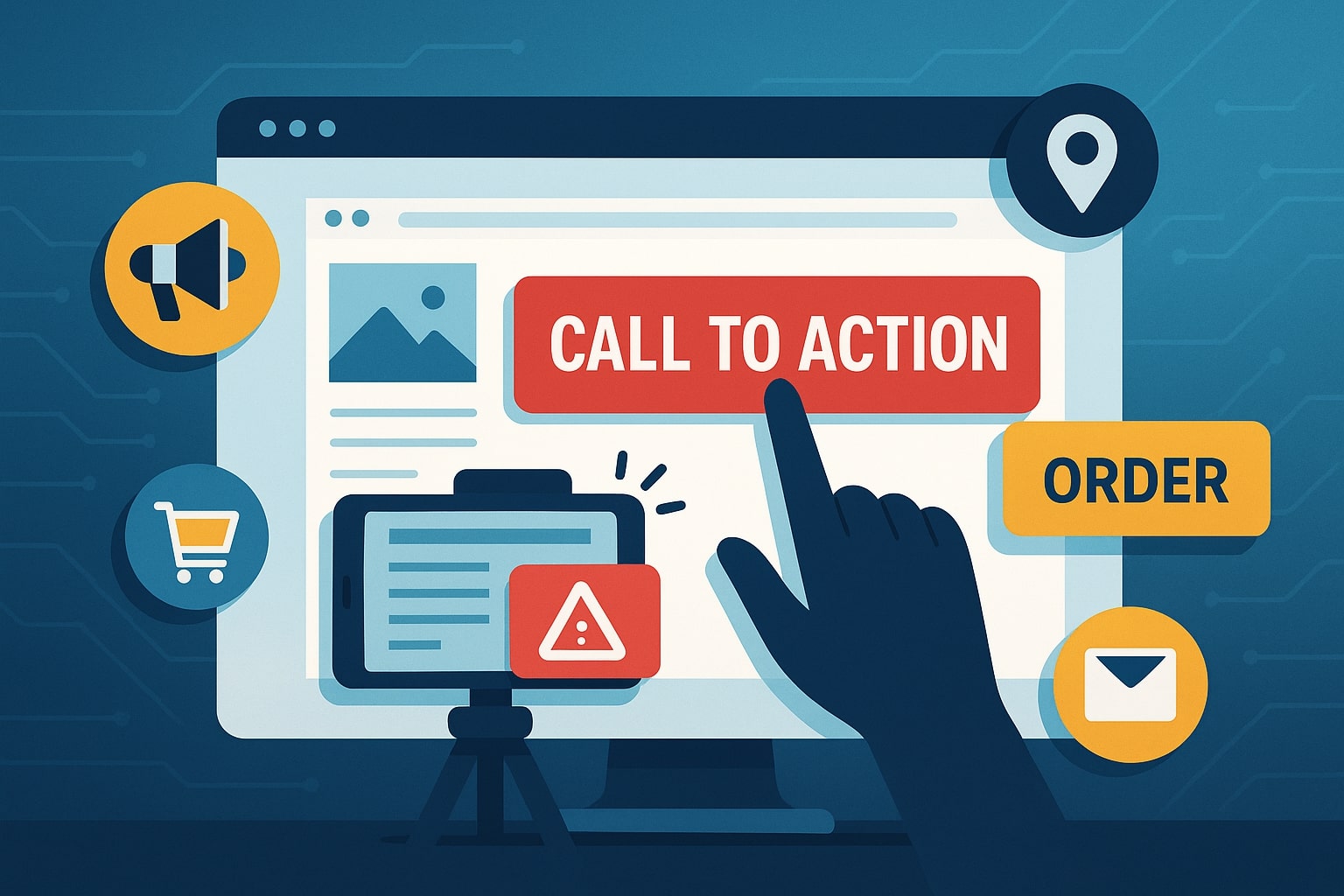
Use Calls-to-Action Effectively on Your Site
Calls-to-action (CTAs) are the guiding prompts on your website that tell visitors what to do next. They can be buttons, links, banners or text phrases that encourage actions like “Buy Now,” “Subscribe,” or “Contact Us.”
Using calls-to-action effectively means placing clear, compelling prompts throughout your content so visitors don’t get lost or leave without converting. For any local business – whether an e-commerce store, a SaaS provider, a blogger, or a neighborhood service – well-crafted CTAs are essential.
They turn passive readers into active customers by guiding them along the conversion funnel. In fact, experts warn that “failing to use calls-to-action effectively is the number one mistake” on business websites. CTAs not only boost conversions and click-through rates, but they also improve user experience and even support your SEO efforts.
A clear, prominent Calls-to-Action can dramatically improve engagement. For example, adding a strong CTA can increase click-through rates and newsletter sign-ups, boost downloads or video views, and ultimately grow sales.
They give visitors a reason to stay, to subscribe, or to purchase – instead of wandering off. As one guide notes, CTAs help your visitor “take the next natural step to learn more, contact you, or buy now”. In doing so, CTAs reduce confusion and keep users moving forward in their journey.
In short, to use calls-to-action effectively means making each page of your site a clear path toward a goal – whether that’s a sale, a lead, a download, or another conversion.
Why Strong Calls-to-Action Matter

Every website goal – from selling products to building an email list – depends on having clear next steps. Effective calls-to-action bridge the gap between visitor interest and the desired outcome.
According to experts, CTAs should either guide the customer to the next step or bring them closer to the conversion – ideally doing both. When these prompts are in place, visitors know exactly what to do.
When they’re missing, businesses often watch valuable traffic slip away. For example, a study cited in BuzzBoard found roughly 70% of small business sites don’t use a clear Calls-to-Action; this can leave potential customers “in limbo, uncertain about what to do next,” harming engagement.
Using CTAs effectively helps both users and search engines. Well-placed CTAs improve the user journey by eliminating guesswork: visitors are guided through information to action. This better engagement can even signal relevance to search engines.
As Search Engine Land explains, including CTAs in your on-page optimization “helps strengthen your user journey and signal relevance to search engines.” Generic “Click here” links do little for SEO or user trust; descriptive, keyword-rich CTAs do more.
In practice, a Calls-to-Action like “Browse our gold earrings collection now” not only tells users what to expect, it tells Google the page is about gold earrings.
Benefits of effective CTAs:
- Higher conversions and CTRs: A clear Calls-to-Action can noticeably “increase click-through rates” and conversions.
- More leads and subscribers: CTAs grow your email list or request contact by explicitly inviting sign-ups.
- Improved engagement: They boost video views, guide downloads, or encourage more browsing.
- Better SEO signals: Descriptive CTAs improve internal linking and relevance signals.
- Guided user flow: Every page tells the visitor what to do next, reducing confusion.
Ultimately, using calls-to-action effectively means making them impossible to miss, easy to understand, and aligned with the visitor’s intent. The next sections discuss how to craft and place CTAs to achieve these goals.
Calls-to-Action Design and Placement Best Practices

The design and placement of a Calls-to-Action can make or break its effectiveness. A good CTA must stand out visually and be placed where users naturally look. Here are key practices to follow:
- Make it highly visible: CTAs should never blend in with the page. Use bright, contrasting colors and generous white space so the button or link draws the eye.
For example, if your site’s color scheme is blue, try a bold orange or green for the Calls-to-Action. The goal is that “if your CTA blends in with the rest of the content, visitors will miss it.” Contrast ensures the CTA is noticed immediately. - Use ample white space: Surround your call-to-action button with empty space so it doesn’t get lost in text. Even one of the best guides warns to avoid “large blocks of text hiding your CTA” by adding whitespace. Well-placed margins and padding make the CTA pop.
- Place CTAs at natural decision points: Think about the visitor’s journey. Include CTAs at the top of a page and again at the bottom or wherever you present compelling information.
For long pages, you can include the same Calls-to-Action in multiple spots (e.g. top, middle, bottom) so skimmers or slow readers both have a chance to see it. For shorter pages or blog posts, typically one at the top and one at the end covers most users.
Importantly, position your CTA above the fold (in the visible area before scrolling) so it’s seen immediately. As WordStream advises, always “keep your call to action button above the fold so that users never miss it”. - Prioritize hierarchy: If a page has secondary buttons (like social share buttons or navigation), make sure they are less prominent than the main CTA. Your primary CTA should be the biggest, brightest element on the page.
Use a larger button size or a more vivid color for your main CTA, and keep other buttons subdued (gray or monochrome) so users instantly see what matters most. - Size and legibility: Calls-to-Action text should be large enough to read easily, but not so huge it looks “obnoxious or intimidating”. The text on the button should stand out but fit harmoniously with your site’s fonts.
On mobile devices, make CTAs touch-friendly by giving buttons enough height/width so fingers can tap without zooming. A responsive design is crucial: ensure CTAs adjust to any screen size, so mobile users don’t miss them. - Maintain consistent design: Use consistent styling for CTAs site-wide. Buttons, fonts, and colors should match your brand but still contrast with backgrounds.
Integrate CTAs seamlessly into your design so they look like part of the site, but still catch the eye. For example, use the same rounded-corner button shape or icon style throughout for brand consistency. - Local context placement: For local businesses, consider specific placement. A contact button or phone link should be obvious on every page, especially the homepage.
For service-based companies, a “Request a Quote” or “Book Now” button might stay fixed in a header or sidebar so it’s always accessible. (User location detection can even auto-display “Call Now” with local area code, though that’s an advanced tactic.)
Example designs: Many effective CTAs are simply large buttons with clear text. For instance, a bright orange button that reads “Start Free Trial” on a light background immediately commands attention.
Or a bold green “Sign Up Now” button contrasts against a white page. Studies even show testing larger button sizes can increase conversions by 10–25%. The takeaway: bigger, bolder, clearer is almost always better.
Crafting Persuasive Calls-to-Action Text

Your CTA’s copy (the words you use) is just as important as its design. Great Calls-to-Action text uses action-oriented, benefit-driven language. Here are guidelines for writing CTAs that convert:
- Use action verbs: Start your CTA with a clear verb like “Get,” “Download,” “Subscribe,” “Start,” or “Book.” Wordstream advises against bland terms like “submit” or “enter” and instead uses “action-packed” words.
For example, use “Start Your Free Trial” instead of just “Submit.” This tells users exactly what will happen and makes them more likely to click. - Keep it short and specific: Longer buttons can confuse users. Aim for 2–5 words in your CTA button text. Say exactly what will happen: e.g. “Download Ebook” or “Reserve a Demo.”
WordStream notes that brevity is key, and having too many words on the button is a mistake. A concise Calls-to-Action tells users the action without forcing them to read a sentence. - Convey value or urgency: Immediately signal the benefit or urgency. Phrases like “Free,” “Now,” “Today Only,” “Limited Time,” or “Instant Access” can boost clicks. For example, a CTA like “Download the Checklist – It’s Free!” or “Sign Up Now for 50% Off!” creates excitement.
WordStream highlights that adding a “sense of urgency” (e.g. “Get 50% off Today Only!”) often yields impressive CTR gains. Even simply adding “Now” to a Calls-to-Action (“Register Now”) can subtly increase urgency. - Emphasize benefits: If possible, include a quick benefit or promise. E.g. “Get My Free Tax Guide” says not just get, but specifically my free tax guide. Using first-person phrases (“my” vs “your”) has been shown to boost clicks in tests.
Make it about the user’s gain. Instead of generic “Learn More,” try “Learn How to Grow Sales.” The Hotjar guide calls CTA text your “closing argument” – it should clearly state what value or outcome the user will get. - Match context: The CTA copy should fit the page content. If the user just read about your e-commerce product, a Calls-to-Action like “Add to Cart” or “View Pricing” makes sense there.
In a blog post about marketing tips, the CTA could say “Download Our Free Marketing Guide.” Tailoring the words to the specific context makes the action feel natural. - Avoid jargon and generic phrases: Steer clear of “Click Here,” “Learn More,” or “Submit.” These weak CTAs don’t excite users or tell them what they’ll get.
Instead, use specific language. For example, “Browse our gold earrings collection today” is far more informative and relevant than simply “Browse our collection”. - Use emotional/power words: Words like “Free,” “Easy,” “Exclusive,” or “Secret” can grab attention. The Hotjar guide even provides “power words” lists to inspire Calls-to-Action phrasing.
If appropriate, speak to a pain point: e.g. a tax consultant might use “Stop Losing Money – Get Your Free Tax Plan.” - Personalize when possible: If you have user data (e.g. name or past behavior), personalize the CTA. Research shows first-person CTAs (“Start my free trial”) outperform second-person ones. While this can be advanced, even segmentation (targeted CTAs for different audiences) improves relevance.
Before your Calls-to-Action button, add context: Many visitors need a bit of persuasion before clicking. Hotjar and others recommend including a short, supportive message above the button that briefly outlines the benefit or addresses a pain point.
For instance, above a “Subscribe” button you might write, “Get weekly email tips to grow your business.” Or above a “Get Quote” button: “Tell us your needs and we’ll provide a fast, free quote.” This “supporting text” gives users a reason to click.
By pairing action verbs with clear value and urgency, your CTA text will motivate clicks. Each word should make the offer more compelling, not more complicated.
Tailoring CTAs to Your Business Type
Different businesses will use CTAs in slightly different ways, though the core principles remain the same. Below is a summary of how various local business models often frame their CTAs:
| Business Type | Common CTA Phrases | Typical Goal/Purpose |
|---|---|---|
| E-commerce/Retail | “Add to Cart”, “Buy Now”, “View Details”, “Shop Now” | Encourage immediate product purchases; funnel shoppers to product pages. |
| SaaS/Software | “Start Free Trial”, “Book a Demo”, “Get a Quote”, “Sign Up” | Drive free trial sign-ups, demo requests, or lead captures. |
| Blog/Content Site | “Subscribe Now”, “Download Free Guide”, “Read Next Article” | Grow newsletter subscribers or audience; share gated resources. |
| Service Business | “Request a Quote”, “Book Appointment”, “Call Now”, “Get Directions” | Generate phone calls, booked appointments, or store visits. |
| Local Restaurant | “Reserve a Table”, “Order Online”, “See Menu” | Increase reservations or takeout orders. |
| Nonprofit/NGO | “Donate Now”, “Join Our Mission”, “Volunteer Today” | Encourage donations, sign-ups for campaigns, or event registrations. |
(Table: Examples of CTAs by business type)
For example, a SaaS startup often uses a bright button saying “Start Free Trial”, since its goal is to sign up new users. A neighborhood plumber might use “Schedule Service” or “Call Now” to turn website visitors into booked jobs.
Bloggers frequently end posts with “Subscribe for Updates” or “Download Our Checklist” to capture leads. The key is to pick the Calls-to-Action that fits the page’s purpose. A product page wants a sale (“Buy Now”); a landing page might want a form submission (“Get Started”); a blog post might want a share or email sign-up.
As BuzzBoard notes for local businesses, CTAs should match common user actions like calling the business or booking online. For instance, they recommend CTAs such as “Get a Quote,” “Schedule an Appointment,” and “Call Now” for service providers.
These examples all tell the visitor exactly what to do in language that resonates with local searchers. Ultimately, test phrasing within your niche: use language that your customers use (LSI keywords like “near me,” specific services, or product names).
Testing and Optimizing CTAs
No matter how well you design and write your CTAs, testing is crucial. User behavior can be unpredictable, so the best way to use calls-to-action effectively is to measure and refine them over time.
- A/B Test everything: Create variations of your Calls-to-Action buttons to see what works best. This could mean changing the button color, size, shape, or text. For example, you might test “Start Free Trial” versus “Get Free Trial” or an orange button versus a green one.
Use tools like Google Optimize, Optimizely, or even Hotjar heatmaps to test and compare variants. Hotjar recommends making A/B testing a regular part of your strategy. Even small changes (a different word, color, or placement) can have big effects on clicks and conversions. - Analyze user behavior: Heatmaps and click-tracking (tools like Hotjar, Crazy Egg, or Google Analytics events) show exactly where people click – or don’t click. If your CTA is getting a few clicks, heatmaps will reveal if users aren’t seeing it.
Analytics can also track funnel drop-off. Look at metrics like click-through rate (CTR) on each CTA, and conversion rates on pages with CTAs. Where do users drop off? Adjust the Calls-to-Action accordingly. - Use surveys and feedback: Sometimes you may need qualitative data. Consider a short on-site survey or feedback widget (e.g., “What’s stopping you from signing up?”) to understand if the CTA is unclear. Customer feedback can point out confusion that data alone might not reveal.
- Iterate on copy and design: Based on testing, tweak your Calls-to-Action text or design. If users hesitate, try stronger verbs or clearer benefits. If they click but then drop off, maybe the landing page (target of CTA) needs improvement.
As one infographic advises, “be creative with your CTA buttons… but test frequently to see how well your visitors are taking your creative CTA endeavors.” - Track conversions end-to-end: Use goal tracking in analytics (Google Analytics Goals, Facebook Pixel, etc.) to tie CTA clicks to final actions (purchase, signup). This tells you if a Calls-to-Action is not just clicked, but actually leading to the desired outcome.
Remember: Continuous optimization is key. Industry leaders run experiments on CTAs all the time. As Automatec notes, “Continuous optimization based on data-driven insights ensures your CTAs remain compelling and effective over time”. Every improvement in a Calls-to-Action can directly add to your revenue or leads.
SEO Tips for CTAs
While CTAs are primarily about conversions, they also tie into SEO (search engine optimization) in important ways:
- Descriptive anchor text: If your CTA is a text link (or even a button link), use meaningful text that includes keywords related to the target page. Rather than a vague “Click Here,” a Calls-to-Action like “Download the SEO Checklist” or “Sign up for Marketing Tips” tells search engines what the page is about.
As Search Engine Land advises, a descriptive Calls-to-Action like “Browse our collection of gold earrings today” signals relevance to Google and improves internal linking. This helps your SEO by building context. - Optimize landing pages: The pages your CTAs link to should be well-optimized. If a CTA drives to a product page, ensure that page has relevant keywords in title, headings, and content.
The CTA and page content should align so Google understands the context. An effective Calls-to-Action essentially creates an internal link with keyword-rich text, which is good for SEO. - Page speed and mobile: CTAs that hinder loading (large images or scripts) can hurt SEO indirectly. Make sure CTA elements don’t slow your page.
A fast, mobile-friendly site (as noted above) is critical: Google favors mobile-friendly sites, and you want CTAs to load instantly on phones. After all, a hidden or slow-loading CTA is an SEO and UX problem. - Use alt text for image CTAs: If you use an image as a Calls-to-Action (like a banner image link), always include descriptive alt text.
For example, <img src=”ebook.jpg” alt=”Download our free eBook on local SEO”>. This helps search engines understand the image and can improve rankings or appear in image search. - Encourage backlinks with CTAs: While indirect, a strong Calls-to-Action (e.g., “Share this guide”) can prompt social shares and backlinks if your content is good. High-quality content combined with a call to share can boost your SEO authority.
- Local SEO integration: For local businesses, include geographic keywords in CTAs or surrounding text when relevant (e.g., “Call us now for tax help in Houston”).
Also, ensure your contact CTA (like “Call Now”) is linked with a clickable phone number (tel:), which Google can index as a local action.
In summary, don’t neglect SEO when setting up CTAs. Use your CTA copy to include relevant phrases, make it easy for Google to crawl, and ensure the user experience around the CTA keeps visitors engaged.
The Search Engine Land article sums it up: CTAs can “signal relevance to search engines” when done right. Good on-page CTAs are another piece of useful content that search engines like.
Common Calls-to-Action Mistakes to Avoid
Even with good intentions, it’s easy to misstep with CTAs. Be mindful of these pitfalls:
- No CTA at all: Many sites simply fail to tell visitors what to do next. As Locable warns, assuming “customers know what to do next” is dangerous – it “sets you up to lose conversions.” Every page needs a CTA. If your pages leave visitors hanging, they’ll bounce away.
- Generic or unclear text: Using bland CTAs like “Click Here” or “Learn More” wastes an opportunity. Search Engine Land specifically cautions against generic CTAs, noting they “downplay the relevance” of the link for users and SEO. Make every CTA phrase meaningful and specific.
- Too many CTAs (choice overload): While a single page may have multiple CTAs for long content, be careful not to confuse visitors with conflicting prompts. Hotjar recommends only one primary CTA per page to avoid decision paralysis.
Locable adds that if you use multiple CTAs on a long page, they should all point to the same offer – just placed in different spots. Don’t accidentally compete CTAs against each other. - Hard-to-find CTAs: Sometimes CTAs are hidden in images, buried under a wall of text, or placed too low on the page. Avoid “burying the CTA in the middle of the content”. If people have to search for it, they may leave.
- Poor mobile usability: If your CTA buttons are tiny on mobile or not responsive, you’ll frustrate smartphone users. Given over 60% of web traffic is mobile, a button that’s hard to tap is a big error. Always test CTAs on phones and tablets.
- Neglecting testing: Assuming a CTA is good without data is risky. A big mistake is launching a CTA and never measuring its performance. Without A/B testing and analytics, you’ll miss opportunities to improve.
By avoiding these mistakes and following the best practices above, you’ll use calls-to-action effectively and turn more visitors into customers.
FAQs
Q1: What exactly is a call-to-action (CTA)?
Answer: A CTA is an instruction to your website visitor to take a specific action. It can be a button, link, or banner with text like “Shop Now,” “Subscribe,” or “Learn More.” Its purpose is to prompt the user to do something that aligns with your business goals, such as making a purchase, signing up for a newsletter, or filling out a contact form.
Q2: Why are CTAs important for my local business website?
Answer: CTAs are vital because they guide visitors toward becoming customers. A well-placed CTA can significantly increase conversions by telling users exactly what you want them to do next. Without a clear CTA, even interested visitors may leave your site without taking action.
In fact, experts say “every single page should have a call-to-action”, since every page is an opportunity to engage a customer or capture a lead.
Q3: How many CTAs should I have on a page?
Answer: Generally, at least one prominent CTA per page is recommended. On long pages (like in-depth articles or long sales pages), you can have multiple CTAs, but they should all point to the same next step or offer.
Locable suggests having one primary CTA per page, and on pages like the homepage you may include more than one (e.g. “Get Started” and “Contact Sales”). Hotjar notes that having too many different CTAs can confuse users, so focus on one main goal at a time.
Q4: Do CTAs affect SEO or search engine rankings?
Answer: Indirectly, yes. CTAs that use descriptive, keyword-rich anchor text can improve your SEO by signaling relevance. As explained by Search Engine Land, including relevant keywords in your CTA links tells search engines more about the content of the destination page.
Also, a good CTA improves user engagement metrics (like time on site and click-through to other pages), which can be positive for SEO. So optimizing CTAs – much like other on-page elements – contributes to a stronger SEO strategy.
Q5: What are some common CTA mistakes to avoid?
Answer: Common pitfalls include: having no CTA at all, which loses conversions; using generic text like “Click Here,” which users and search engines ignore; hiding the CTA in the layout so it’s hard to see; and using too many conflicting CTAs on one page.
Also avoid non-responsive design (ensure buttons work on mobile) and neglecting to test your CTAs. By avoiding these mistakes and making CTAs clear and compelling, your site will perform much better.
Q6: How can I improve a CTA that isn’t working well?
Answer: Try testing variations. Change one element at a time – for example, the button color (red vs green), the phrasing (“Join Now” vs “Get Started”), or the placement on the page. Use A/B testing tools or heatmaps to see which version gets more clicks.
You can also improve the surrounding context: add persuasive copy above the CTA or include social proof nearby. Collect data from user behavior and iterate on the CTA until it resonates. Remember, even small tweaks (like adding the word “Free” or using first-person language) can significantly boost engagement.
Conclusion
Effective calls-to-action are at the heart of converting casual browsers into buyers, subscribers, or contacts. For any local business – from e-commerce shops to service providers and bloggers – mastering CTAs means designing eye-catching prompts, writing compelling text, placing them strategically, and continually optimizing.
Use action-oriented verbs, make buttons stand out with color and whitespace, and always tie each CTA to your business goals. Remember the insights from marketing experts: CTAs should be big, bold, clear, and relevant. They should guide the visitor smoothly toward the next step in the funnel.
Moreover, don’t overlook the SEO angle: clear, descriptive CTAs can improve user flow and even send positive signals to search engines. By rigorously testing different CTAs and tracking their performance, you ensure that your site keeps improving over time.
In the end, the best way to use calls-to-action effectively is to keep the visitor’s needs in mind at every step. Provide them exactly what they want or need next, and they’ll be far more likely to take action.