
How to Use Heatmaps to Improve Conversions
Improving your website’s conversion rate often means digging into how users interact with your pages. Heatmaps provide a powerful visual layer over traditional analytics, revealing exactly where visitors click, scroll, and hover.
By translating complex user behavior into intuitive color-coded maps, heatmaps show what grabs attention and what gets ignored on your site. Businesses – whether e-commerce stores, SaaS apps, blogs or services – can use heatmaps to improve conversions by identifying high-engagement areas, spotting friction points, and optimizing page layouts based on real user data.
In this guide, we’ll explore what heatmaps are, why they matter for conversion rate optimization (CRO), and how to leverage popular tools (Hotjar, Crazy Egg, Microsoft Clarity, etc.) to turn website traffic into customers.
What Are Heatmaps?
A heatmap is a graphical overlay that visualizes user activity on a web page using colors. Warm colors (reds and oranges) indicate high activity or engagement, while cooler colors (blues and greens) show lower interaction.
For example, a heatmap can highlight the sections of a page that get the most clicks or the parts where users spend the most time. Unlike raw metrics (e.g. “pageviews” or “bounce rate”), heatmaps give the full context: they show where on the page user attention is concentrated.
This can reveal if visitors are clicking on key buttons (or clicking on non-clickable elements by mistake), and how far users scroll before leaving.
There are several types of heatmaps, each focusing on different user behaviors:
- Click Heatmaps (Click Maps): Show exactly where users click or tap on the page. Hotspots (red areas) reveal buttons or links that get heavy attention, while cold areas get few clicks.
Click maps quickly show if visitors interact with the elements you intended (e.g. your “Buy” button) or if they are distracted by something else. - Scroll Heatmaps: Indicate how far visitors scroll down the page. They use gradients to show the percentage of users who reached each depth. Scroll maps help you see if important content or CTAs are actually seen, or if most users stop scrolling early.
For instance, if a key call-to-action is placed near the bottom but only 20% of users scroll that far, you know to move it up. - Hover/Movement Maps: Track mouse movements or hovers, assuming that cursor activity roughly correlates with eye gaze.
By seeing where users move their cursor without clicking, you can infer which areas draw visual attention. This is useful for understanding interest even if no click occurs. - Attention or Eye-Tracking Heatmaps: Advanced tools can use actual eye-tracking technology to pinpoint exactly where users’ eyes land and for how long. These maps provide very precise insights into which headlines, images, or page regions draw the most attention.
(Note: true eye-tracking is rare in heatmap software, but some tools approximate it with cursor/hover data.) - Geographic Heatmaps: Show user activity by region on the page, often used in mapping user locations, but some website heatmap tools also break down clicks by user segments.
- Engagement Heatmaps: Combine multiple signals (clicks, scroll depth, time on page) into a single “engagement” metric, highlighting sections of the page that keep users engaged or where they drop off.
By using these heatmap types together, you get a full picture of user behavior – for example, noticing that lots of users scroll to a promo banner but few click it, or that a link looks clickable when it isn’t, causing confusion. This visual data is the first step in pinpointing what’s working on your page and what needs to change.
Why Use Heatmaps to Improve Conversions
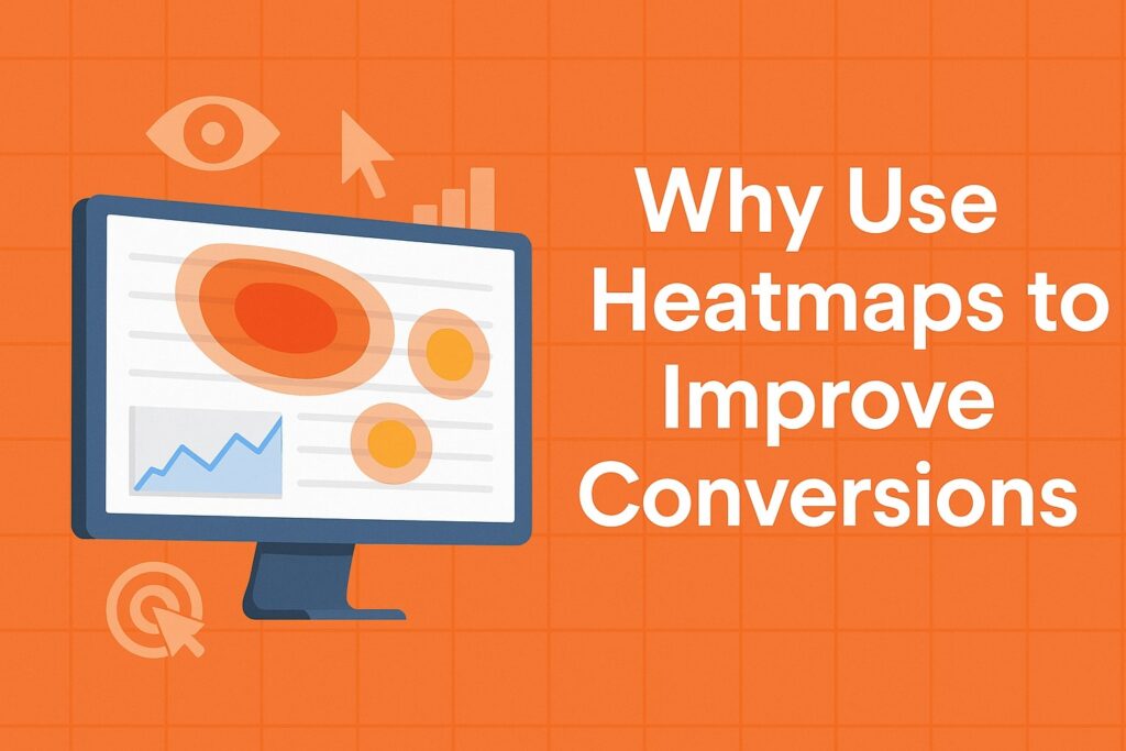
Heatmaps translate user data into actionable insights that directly impact conversions. Instead of guessing why visitors bounce or fail to convert, you can see the evidence. The main ways heatmaps improve conversions are:
- Reveal User Focus: Heatmaps clearly show where visitors focus their attention – for example, which images they click and where they pause.
This lets you amplify what’s working (e.g. placing important CTAs in high-attention zones) and fix what’s broken (e.g. relocating elements that get ignored). - Identify Friction Points: By highlighting unexpected clicks or dead zones, heatmaps expose UX issues. For instance, if many users repeatedly click on a non-clickable banner (a “dead click”), that’s a sign of confusion.
Or if a checkout button gets a few clicks, maybe it’s hard to see. Spotting these problems lets you remove obstacles – for example, clarifying clickable elements or simplifying forms – to smooth the path to conversion. - Optimize CTA and Content Placement: Heatmaps tell you if your call-to-action (CTA) buttons are placed optimally. If a CTA appears where few users scroll or click, it likely needs moving. As Neil Patel notes, heatmaps “measure how far users scroll, where they click, and what captures their attention.
That’s information you can use to optimize your site’s layout… and make your CTAs more clickable”. In practice, repositioning CTAs or important content into “hot” areas (red zones) can significantly boost engagement. - Fine-Tune Layout and Design: By combining scroll maps with click maps, you can assess whether visitors see the content in the order and format you expect. For example, if a key feature or signup form is positioned so low that most users never reach it, you can move it higher.
If a navigation menu link is barely clicked, consider simplifying the menu. These adjustments – guided by real heatmap data – directly improve conversion opportunities. - Prioritize Testing and Development: Heatmaps show the “hotspots” of your site, helping you focus optimization efforts where they matter most. Instead of A/B testing every page randomly, you can target pages that show low engagement or high drop-off in heatmaps.
This makes your CRO program more efficient. (For example, Neil Patel advises using heatmaps on the most important pages — homepage, landing pages, and high-traffic posts — rather than every page.) - Support A/B Testing: Heatmaps provide the why behind A/B test results. An A/B test might tell you that “Variant B” converted better, but only a heatmap can reveal what changed user behavior.
As one source explains, heatmaps can be used alongside A/B tests to give context. When a CTA’s location is tested, a heatmap can show whether clicks increased because users engaged more with the new position. In short, heatmaps make your testing more informed and actionable.
In practice, many businesses report impressive gains from heatmap-driven changes. For instance, Hotjar customers share cases like a 40% conversion increase after fixing issues exposed by heatmaps.
Another Hotjar user noted that almost no visitors were scrolling past the top of their page, so they redesigned the landing section – resulting in a 60% revenue increase.
These examples illustrate that small layout tweaks, guided by heatmap insights, can have big conversion impacts.
As one eCommerce agency puts it, advanced heatmap analysis helps “transform websites into conversion machines” by revealing exactly what’s driving or hindering sales on the site.
In summary, heatmaps give you an evidence-backed roadmap to improve UX and CRO. They show real user behavior (rather than you guessing), and help you make data-driven decisions that boost conversions.
Implementing Heatmaps for Conversion Optimization
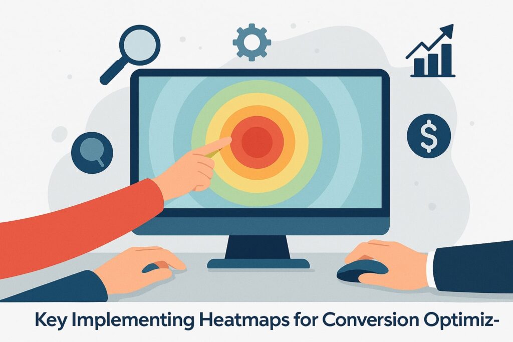
To use heatmaps effectively in your CRO strategy, follow these key steps:
- Choose Your Heatmap Tool and Install Tracking: Select a heatmap tool (e.g. Hotjar, Crazy Egg, Microsoft Clarity, etc.) and add its tracking code snippet to your site. Most tools require no coding beyond a simple JavaScript snippet, so setup is quick. Once installed, the tool will begin collecting click, scroll, and mouse data on your pages.
- Select Target Pages: Focus heatmaps on your most important pages — those critical to conversions. As noted by Neil Patel, it’s “not efficient to add heatmaps to every page of your site.
Instead, use them on the most important pages like your home page, landing pages, or high-traffic blog posts”. These pages could be your homepage, key product or service pages, checkout or signup pages, and any content pages that drive leads (such as popular blog posts with CTA offers). - Collect Data: Allow the heatmap tool to gather enough data from real visitors. (The more data, the clearer the heatmap.) Many tools let you set a threshold (e.g. 1,000 pageviews) before finalizing the heatmap.
Run the heatmap for at least a few days or until the tool indicates sufficient data. Remember to capture traffic from different devices – mobile vs desktop – to compare behaviors across screen sizes. - Analyze the Heatmaps: Once data is in, examine the color-coded maps:
- Look at the click map: identify which buttons or links are getting lots of clicks (hotspots) and which receive none. Are users clicking where you want them to? For example, if a “Buy Now” button is in a cold zone, consider moving or styling it more prominently.
- Check the scroll map: note how far users scroll on average. If key content or CTAs are mostly above the “red line” of 50% scroll, you may need to shorten the page or reposition CTAs to higher up.
- Inspect hover/movement maps: see where users’ cursors linger. Do they hover over images or text that aren’t clickable? This could indicate clickable confusion or interest that isn’t acted on.
- Spot dead clicks: some tools highlight when users click an element that doesn’t link anywhere. These indicate UX flaws (like an image that looks like a button). Fixing dead-click issues is a quick win.
- Compare device heatmaps: use heatmaps on both desktop and mobile. Behavior often differs by device, so adjust the mobile layout if mobile users, say, never scroll past the fold but desktop users do.
- Look at the click map: identify which buttons or links are getting lots of clicks (hotspots) and which receive none. Are users clicking where you want them to? For example, if a “Buy Now” button is in a cold zone, consider moving or styling it more prominently.
- Generate Hypotheses and Make Changes: Use the insights to develop improvements. For example, if a scroll map shows many users bounce after a short scroll, try moving the CTA higher or rewriting the intro to be more compelling.
If click maps reveal a feature is ignored, make it more prominent. The Commerce Shop suggests visualizing behavior to “identify high-engagement areas to amplify what’s already working” and “pinpoint friction points that cause visitors to drop off”. - Test and Validate: Don’t rely on assumptions — test your changes. Implement the suggested change (e.g. new button location, new design element) and then use an A/B test or another heatmap snapshot to see if it had the intended effect.
As Neil Patel describes, after an optimization, you can use the same heatmap tool to confirm if users are now clicking in the right place or scrolling further. This closes the loop and ensures that heatmap insights translate into actual conversion gains. - Iterate Continuously: Conversion optimization is ongoing. After each round of changes and tests, rerun heatmaps on the affected pages. Track whether more users are now converting and if new issues have emerged. Over time, building a culture of “data-driven UX tweaks” will steadily raise your conversion rate.
By following these steps with a professional tool, you use heatmaps to improve conversions in a structured way. The combination of visual data and testing ensures you’re making the right changes.
Remember, as Userpilot’s guide notes, heatmap analysis should be paired with other analytics (funnel data, recordings) for full context. But with heatmaps giving you the “why” behind user actions, you can fix the UX and marketing elements that matter most for conversions.
Popular Heatmap Tools and Platforms
Several tools make it easy to generate and analyze heatmaps. Below are some widely used platforms, along with their key features and pricing highlights:
- Hotjar: A very popular user behavior platform. Hotjar offers click, scroll, and move heatmaps, plus session recordings, funnels, and surveys for qualitative feedback. It uses “rage click” maps to show where users rapidly click in frustration. Hotjar’s heatmaps are trusted by over 1.1 million websites.
Hotjar has a free plan (allowing up to 35 daily heatmap sessions) and premium plans starting around $39/month. A Hotjar case: one user reported a 40% conversion boost after resolving issues with their heatmaps uncovered. - Crazy Egg: The original heatmap tool, Crazy Egg provides click maps, scroll maps, confetti maps, overlay maps, and more. Its famous “Confetti Report” segments clicks by referral source or user type.
For example, Crazy Egg helped a SaaS company quickly see how new vs returning visitors clicked, allowing targeted UX tweaks. Crazy Egg plans start at around $99/month.
As one Crazy Egg testimonial notes, it “shows the kinds of insights we are getting” and helps site owners instantly improve their site. - Microsoft Clarity: A 100% free heatmap and session-replay tool from Microsoft. It offers click, scroll, area, and conversion heatmaps, and even has AI-driven “Insight” reports to highlight important elements. Clarity records all sessions (no sampling), making it a great zero-cost option for any site.
For example, Neil Patel’s team used Clarity to analyze blog posts, discovering that ~40% of users dropped off after a blog’s first CTA. They then added a clickable table of contents to boost engagement — a change driven entirely by Clarity’s heatmap data. - Mouseflow: A comprehensive digital analytics platform with heatmaps plus session replays. Mouseflow offers click, scroll, attention, movement, geo, and live heatmaps.
It automatically records 100% of your traffic (unlimited sessions) and lets you filter heatmaps by segment (e.g. new vs returning). Mouseflow’s pricing starts around $31/month, and it also includes form analytics and funnel reports. - Smartlook: A user analytics tool offering click, movement, and scroll heatmaps. Smartlook records all sessions and organizes heatmaps into galleries for easy review. It has a free plan (up to 3,000 sessions/month) and paid plans (around $55).
Like the others, Smartlook helps correlate visual heatmaps with individual session replays and event data. - Other Tools: There are many more solutions. Lucky Orange provides dynamic real-time heatmaps alongside live-chat and survey features. Contentsquare offers advanced attention and touch heatmaps for enterprise sites.
FullStory and Heap include heatmapping within their broader analytics suites (often used by SaaS products). When choosing, consider factors like pricing, ease of implementation, and extra features (recordings, segmentation).
All of these tools share a common goal: helping you visualize user behavior so you can make data-driven optimizations.
As the Neil Patel guide notes, heatmap tools enable “marketers to move beyond quantitative analysis and collect qualitative data that explains why users behave the way they do”. In short, they give you eyes on the page.
Below is a summary table of some popular heatmap tools:
| Tool | Key Features | Pricing/Notes |
|---|---|---|
| Hotjar | Click, scroll, move (hover) heatmaps; session recordings; surveys; rage-click maps | Free plan (up to 35 sessions/day); Premium from ~$39/mo |
| Crazy Egg | Click, scroll, confetti, overlay maps; A/B testing; segmentation by source | Plans from ~$99/mo; 30-day trial available |
| Microsoft Clarity | Click, scroll, area, conversion heatmaps; full session replay; AI insights | 100% free (no data limits) |
| Mouseflow | Click, scroll, attention, movement, live heatmaps; full traffic recording; form analytics | Plans from ~$31/mo; 500+ sessions free tier |
| Smartlook | Click, movement, scroll heatmaps; auto-record 100% of sessions | Free up to 3,000 sessions; Pro ~$55/mo |
| Lucky Orange | Real-time heatmaps; session recordings; dynamic heatmaps; live chat | (See tool site) |
| Contentsquare | Advanced click/scroll/attention heatmaps; behavioral insights | (Enterprise-level solution) |
| FullStory | Heatmaps plus robust session replay and segmentation | (Enterprise focus) |
(Sources: Hotjar, Crazy Egg, and Neil Patel guide on heatmap tools.)
Each tool has its strengths. For example, Hotjar is known for ease-of-use and a generous free plan, while Crazy Egg’s unique confetti map helps break down clicks by user source.
Microsoft Clarity is appealing for its zero cost. In practice, many businesses start with a free or low-cost option (like Clarity or Hotjar) to gather insights and may later add a premium tool for more features as needed.
Applying Heatmaps Across Different Businesses
Heatmaps are versatile and beneficial for all types of websites. Here’s how different sectors can leverage them:
- E-commerce: Online stores can use heatmaps to analyze product pages, category pages, and checkout funnels. For instance, heatmaps can reveal which product images or promotions get clicked the most, and which items customers ignore.
A retailer might discover that users rarely scroll to see product reviews, suggesting a layout change. The Commerce Shop explains that heatmaps let e-commerce sites “identify high-engagement areas to amplify what’s working” and “pinpoint friction points that cause visitors to drop off”.
By repositioning popular products or streamlining the add-to-cart button’s location based on heatmap data, e-tailers often see higher conversion rates. (One Hotjar case showed a 40% conversion lift on a signup page after fixing issues found with heatmaps.)
Even on checkout pages, a click map can spot confusing fields or links, enabling you to simplify the process and reduce cart abandonment. - SaaS Products: For software-as-a-service companies, heatmaps are usually applied inside the app or on landing pages. In-app heatmaps can highlight which features users interact with most (and which are ignored).
For example, if users never click a new feature button, that signals a need for better onboarding. The Userpilot SaaS analysis notes that heatmaps can identify “areas that lack onboarding” and reveal where customers drop off.
On marketing sites, SaaS firms use heatmaps on pricing pages, signup forms, and feature pages to ensure key CTAs and value propositions are noticed. Heatmap data might show that 80% of users don’t scroll down to a pricing table, suggesting it should be moved higher.
By continuously monitoring these maps, product teams can iteratively improve user engagement and sign-up rates. - Blogs and Content Sites: Content-driven sites can also benefit. Bloggers and publishers often place subscription forms or content upgrades at the end of articles, but a scroll heatmap might reveal that only 30% of readers ever reach that point.
Knowing this, you could move the signup form closer to the top or add multiple CTAs in the “hot” reading zone. Neil Patel’s team applied this insight: Clarity’s heatmaps showed about 40% of readers were dropping off after the first call-to-action (the introduction). They used this finding to implement a clickable table of contents and shorten intros, which significantly increased reader engagement.
In summary, content sites use heatmaps to verify that readers see the intended content and to optimize ad or CTA placements in the most-viewed areas. - Lead-Gen and Service Sites: Any site that relies on form submissions or lead generation can use heatmaps to optimize forms, pricing plans, or portfolio sections.
For example, a heatmap might show that a “Contact Us” form at the bottom of a page is hardly seen, so moving it up could generate more leads.
Or, a financial services site might test different layouts of their sign-up page and use a heatmap to decide the best button placement. - Mobile Apps and Landing Pages: Even mobile interfaces can be heatmapped. Many tools (like Hotjar and FullStory) support mobile heatmaps. For apps, understanding touch heatmaps can improve design.
For landing pages (often used in paid ads), heatmaps quickly validate if the messaging and CTA align with what users focus on, allowing for fast landing page optimization.
In each scenario, the process is similar: generate heatmaps on key pages, interpret the visual data, and then make design or content changes to guide more visitors toward the desired action. By doing so, businesses across industries use heatmaps as a critical part of their CRO toolkit.
As one marketer summarized: heatmaps provide a wealth of insight into customer behavior, enabling seamless optimization and improved conversion rates (source: Branding & Marketing Agency post on heatmaps).
Best Practices and Tips
To get the most out of heatmaps and ensure they truly improve conversions, follow these best practices:
- Focus on Key Pages: Don’t spread your efforts too thin. Concentrate heatmap analysis on pages that matter for conversions – like the homepage, main landing pages, product pages, or high-traffic content. Heatmapping every single page is inefficient; instead, optimize your highest-impact pages first.
- Use Multiple Heatmap Types: Each map type tells a different story. For any given page, consider looking at both click and scroll maps together. If you have access to hover/movement maps, use them too. Combining data (clicks + scrolls + movements) gives a fuller picture of engagement.
- Segment Your Data: If possible, segment heatmaps by device (desktop vs. mobile) and by user type (new vs. returning). Behavior often varies – for example, on desktop users might scroll more, while mobile users might click differently.
Crazy Egg’s confetti maps allow segmentation by traffic source and device. This can reveal insights like “Returning visitors prefer a different CTA placement than new visitors.” - Gather Enough Data: Heatmaps need a sufficient number of pageviews to be reliable. While there’s no magic number, a few hundred clicks or scrolls usually give a clear pattern.
If your traffic is low, run the heatmap longer or consider a quick user-testing session instead. Many tools let you specify a minimum session count before finalizing a heatmap. - Combine with Other Analytics: Use heatmaps in conjunction with tools like Google Analytics. For example, if Analytics shows a certain page has a high bounce rate, run a heatmap on that page to see why.
Conversely, if a heatmap reveals a problem (say, no clicks on a CTA), double-check your web analytics funnel to confirm the impact on conversions. Heatmaps add qualitative insight to the quantitative data. - Iterate and Test: Treat heatmap findings as hypotheses. After making a change (like moving a button), don’t assume it works – test it. Use A/B testing to compare the old vs. new design.
Then rerun the heatmap to confirm that user behavior changed as expected. For example, if a new CTA placement leads to more clicks (heatmap hotter), you’ve validated the move. - Remove Distractions: One common fix revealed by heatmaps is to remove or tone down distracting elements. If an image or banner is drawing clicks away from your main CTA, simplify the page.
Neil Patel points out that you should “remove distracting elements like unclickable images that cause friction in the user journey”, and place important elements higher where users engage more. - Mind Mobile Optimization: Ensure your mobile site is heatmapped too. Because desktop and mobile layouts differ, it’s best to analyze them separately.
Some tools automatically create mobile heatmaps alongside desktop ones. Check that buttons aren’t too small and important content isn’t hidden on smaller screens. - Maintain Privacy and Performance: Heatmap tools typically anonymize data, but be aware of privacy laws. Also, monitor page load times after adding heatmap scripts – most modern tools are lightweight, but always test to ensure they don’t slow your site.
- Document and Share Insights: Treat heatmaps as valuable data. Save snapshots of heatmaps before changes, and keep notes on what you observed.
Share these visuals with your team – sometimes seeing a hot zone on a color map is much clearer than describing it in words.
By following these tips, you maximize the reliability of your heatmap insights. The goal is to use real user data to inform concrete improvements, rather than guesswork.
Frequently Asked Questions
Q: What is a heatmap in web analytics?
Answer: A website heatmap is a visual tool that shows how users interact with a page. It overlays colors on your design – warmer colors (red/orange) for areas with high activity and cooler colors (blue/green) for low activity.
Heatmaps reveal where visitors click, how far they scroll, and which page elements get attention or are overlooked. In essence, a heatmap shows “how users scroll, click, and navigate your website”.
Q: How do heatmaps help improve conversions?
Answer: Heatmaps pinpoint exactly what users focus on (and what they ignore) so you can optimize the page accordingly. By identifying high-interest zones, you can move critical CTAs or offers into those spots.
By spotting areas of friction (e.g. important links getting no clicks), you can fix design issues. As a result, heatmaps help refine user experience and page layout in ways that make conversions more likely.
Q: How many visitors do I need for a useful heatmap?
Answer: Generally, more data is better. Aim for at least a few hundred visits on the page you’re mapping before drawing conclusions. The exact number depends on traffic and page complexity.
Many tools let you specify a target (e.g. “1,000 pageviews”) before finishing the heatmap. If you have low traffic, run the heatmap longer or use targeted user tests instead.
Q: Can I use heatmaps on mobile sites or apps?
Answer: Yes. Most heatmapping tools support mobile web heatmaps. They often automatically capture clicks and scroll data from mobile visitors. You can also use hot-cold color overlays on mobile screen layouts.
For native apps, some tools like FullStory provide app heatmaps. Just be sure to analyze mobile heatmaps separately, since user behavior can differ significantly from desktop.
Q: Do I need to be technical to set up heatmaps?
Answer: Not really. Most heatmap platforms provide a simple JavaScript snippet that you paste into your site (or via your tag manager). Once installed, they do the data collection automatically. No special coding is needed beyond that.
Some tools also offer CMS plugins (e.g. WordPress) for easy integration. After setup, all analysis is done in a visual dashboard.
Q: What’s the difference between a heatmap and Google Analytics?
Answer: Google Analytics shows metrics (like bounce rate, conversion rate, click-through numbers) but doesn’t show where on the page users clicked or scrolled. A heatmap adds that visual layer on top of your page.
In other words, GA tells you what happened (e.g. 30% bounce), while heatmaps help explain why by showing what users did on the page. Using both together gives a fuller picture.
Q: Which heatmap tool is best?
Answer: It depends on your needs. Hotjar and Crazy Egg are popular general-purpose tools. Microsoft Clarity is great for a free, no-cost option. Mouseflow and Smartlook provide robust features for session replay and app behavior.
Consider factors like budget (free vs paid), number of monthly sessions, and extra features (surveys, recordings). Many companies use more than one: for example, Neil Patel’s team uses Clarity for blogs because it’s free, while others use Hotjar’s integrated suite for smaller sites.
Conclusion
Heatmaps are an invaluable resource for any business that wants to turn visitor behavior into higher conversions. By visualizing where users click, scroll, and linger on your pages, heatmaps uncover the hidden patterns behind your analytics numbers.
They allow you to identify and fix UX issues – removing distractions, adjusting CTAs, and streamlining content – in a data-driven way. As the case studies show, acting on heatmap insights can yield dramatic improvements (e.g. double-digit lifts in conversion rate).
To summarize: pick a few key pages on your site, install a heatmap tool, and let it collect data. Analyze the resulting maps to see which elements grab attention and which go unnoticed. Then iteratively redesign and test those elements.
Tools like Hotjar, Crazy Egg, or Microsoft Clarity make this easy by providing click, scroll, and even “rage click” maps. Over time, you’ll learn exactly how real users interact with your site, enabling you to optimize their journey and boost conversions.
In the end, using heatmaps is about removing guesswork. They show exactly where visitors are engaged or frustrated, so you can make informed changes.
By embracing heatmap analysis as part of your CRO process, businesses of all types – e-commerce, SaaS, blogging, and more – can greatly improve user experience and conversion rates. Heatmaps help turn passive page views into actionable insights, ultimately increasing the bottom-line results of your website.